On November 12th, the "Most Beautiful Books" in 2018 was announced. Twenty-five books from 20 publishing houses won the title of "Most Beautiful Books" this year, and they will represent China in the "Most Beautiful Books in the World" in 2019.
This year’s "China’s Most Beautiful Books" contest began in June this year, and a total of 541 volumes of 326 participating books were received. After two rounds of voting by all the judges, 25 "most beautiful books" of this year were produced on November 10th.
Founded in 2003, "The Most Beautiful Book" is an annual book design selection activity sponsored by Shanghai Press and Publication Bureau. For more than ten years, the "Most Beautiful Books" jury was entrusted by the German Book Art Foundation, the organizer of "The Most Beautiful Books in the World" in Leipzig, Germany, to invite top book designers at home and abroad to serve as judges, select and recommend the "Most Beautiful Books" from China in that year and send them to Leipzig, Germany to participate in the selection of "The Most Beautiful Books in the World" in the next year. Over the past decade, 15 batches of 321 kinds of "the most beautiful books" from China have appeared in Leipzig, Germany, and 19 kinds have won the award of "the most beautiful books in the world", including 2 gold medals.
For more than ten years, the evaluation of "The Most Beautiful Book" has always paid attention to the integrity of book design, the perfect combination of book content and form, the improvement of book function by book design, the harmony and unity of design style and suitable feel, and the application of technical means as an important element of design. After more than ten years of advocacy and accumulation, the concept of "the most beautiful book" has been increasingly accepted by the publishing and design circles in China.
Invited by the "Most Beautiful Books" jury, Japanese designer Mr. Song Tian Masamatsuda, German designer Ms. Konstanze Berner, China Beijing designers Mr. Liu Xiaoxiang and Mr. Zhang Zhiwei, China Guangdong designer Mr. Hong Wei and China Taiwan Province designer Mr. Huang Yongsong served as the invited judges of this year’s "Most Beautiful Books".
Attachment: Winners and comments of "The Most Beautiful Book" in 2018
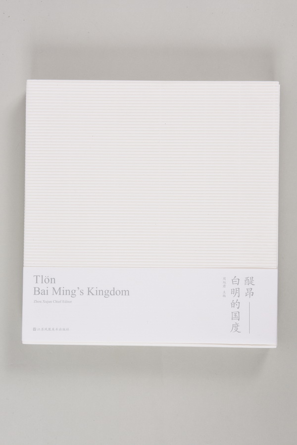
Jiangsu Fenghuang Art Publishing House
Comments: The elegant gray tone of the book and the texture-rich paper used are very harmonious with the style of the ceramist’s works. The colorless and concave title needs readers to look carefully to form an introverted style. The concave-convex feeling of the seal reminds people of the production process of pottery, and also makes readers have expectations and reading desires for the content. The content of the book is mainly pictures, and the blank layout controls the rhythm of reading, and the priorities are clear, which sets off the author’s ceramic works.
The field of history
China Building Industry Press
Square books indicate many possibilities of space design on paper. Through the dialogue between architects and book designers in China, Japan and South Korea and the display of design works, the graphic designers in the space of paper reflect the control, understanding and design process of the "field" in architecture and paper, and the gap between the characters in typesetting is wide, or vertically or horizontally, suddenly large and small, and obliquely shooting at 45 degrees, which reflects different creative ideas, spatial awareness and layout logic of different styles. The paper material is soft, and the text content and architectural design concept are interlaced in the cube formed by thickness. The Chinese, English, Japanese and Korean characters have various typesetting forms.
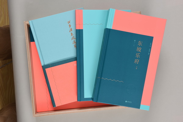
Beijing Joint Publishing Company
This book uses a wooden box, which looks like an object. Open the box, the color matching of books is very unique, novel and pleasing to the eye. There are books and books, which is the popular way at present. The drawings in the book are beautifully designed, made of special paper, and of moderate size. It is commendable that the designer uses red for the annotations in the book, which is elegant with the main text.
Huichuang Youth: A Collection of Digital Media Art and Animation Works
Higher education press
The colors used in book design are very modern, and with abstract geometric figures, they have a strong visual impact and are full of youth. Every part of the book is combined with double contrasting colors, which is easy to identify at the incision of the book and convenient for readers to read and retrieve. Books are small and thick, with moderate feel and suitable for reading.
Shark
Literature and art development publishing house
Hand-made cover paper presents water ripples in line with the theme of the book, and the concave and convex texture increases the simplicity of the book. Concise text information is dotted on the spine of the book, which is convenient to find from the bookcase. The text uses simple gray-blue spot colors and the most restrained design elements to form an elegant and rhythmic layout. The calm and elegant overall style brings readers into the mysterious ocean world.
Spring blossoms facing the sea
Jiangsu Fenghuang literature and art publishing house
The uneven handwriting on the cover and the paper full of texture reflect the collision between tradition and modernity. The spine binding technique is simple and practical, and the plain cotton thread conforms to the tonality of this book. Text papers with different colors and textures distinguish the contents of books: Haizi’s poems are orange, representing the sun and the earth. Velco’s paintings are white, which represents pallor and depression. When two people meet, they sink into the soil (earth color). The incision is bound by riding nail which is cut first and then folded, which is unique.
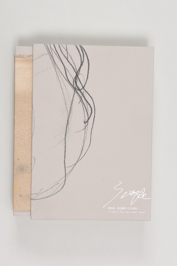
Chongqing publishing house
Record the process of facial sketch comprehensively. The image adopts mirror image effect, and the subject is reflected from multiple angles by montage, which increases the reading pleasure. The package has visual coherence.
Xiangna Gallery
Shanghai People’s Fine Arts Publishing House
The overall shape of the book is slender. At first glance, it feels like a box with a sense of the future. The ratio of length to width is very comfortable, and the sense of weight of the book makes readers not surprised. The white cover is dotted with black numbers, which clearly conveys the history of the gallery. The soft paper in the text is different from the materials in the previous album, which increases the comfort of browsing. There is a huge amount of information, but the layout is orderly, the rhythm is moderate, and the overall design style is simple and quiet.
A brief history of the development of camellia bouquet in "micro-view"
China Building Industry Press
This book is a science and technology book. The cover is die-cut and the light pink tone is reminiscent of petals. The pink color that runs through the cover and text of the book is matched with the rhythmic layout design, and the two colored ribbons that are the finishing touch echo the two bright yellow pages in the middle of the inner page, embellishing the yellow of the camellia stamens. This design wins more with less, bringing readers into a world of camellia. The design of charts in the book not only extends the readability of information, but also enriches the formal language of design.

Commercial press
There are traces of birds everywhere. Two lines run through the text to represent the flight trajectory of birds and also represent the versions of the works of two translators. This design is quite poetic, light in material, and it fits the image of birds without showing emotion.

Beiyue literature and art publishing house
This is a set of low-cost books suitable for reading. Designers strive to be simple and clear in the design and use of paper. The concave pattern on the cover presents different scenery and lines in the author’s hometown, reflecting visual symbols such as water, rice fields, houses and wheat waves. The black text on the cover is arranged up and down, and the design is unique. Looking through the contents of the book, the version is designed with a large margin. A line does not exceed 30 words, and the number of lines on a page is controlled within 24 lines, which is beneficial to reading. The judges appreciated the designer’s attempt at this low-cost book design.

Shandong friendship publishing house
This book helps the blind to perceive the characters smoothly and read their contents by touching the source and development changes of Chinese characters and connecting with the cultural connotation behind the words. The book cover is designed in yellow and black, which looks heavy but actually light. Braille fonts on the inner page have a strong sense of touch and reflect the evolution process of Braille fonts. At the same time, in order to be suitable for ordinary readers to read, the text is specially matched with Braille, and the text can also be touched. The overall design of this book is concise and clear, and the visual effect is outstanding.

Jiangsu Fenghuang Art Publishing House
Color structure and word processing seem to be on the cloud, and the cover incision is mixed and exquisite. It would be better if it were lighter.

Jiangsu Fenghuang Art Publishing House
The perfect unity of design and content is very rare for the more difficult chronicle design. This design skillfully outlines the word "Gao" with thread fitting, adding a literary color. The text takes time as the context, and the layout is rigorous, leaving blank and ethereal, and the image of China is consistent with the cause of Gao Ershi, the protagonist of this book. The choice of paper is exquisite and light, and the signature position of the protagonist on the letter sleeve is clever and quiet. Taking the protagonist’s calligraphy as the book coat, the design is just right.

Shaanxi normal university publishing head office
This book is divided into two volumes, the main volume introduces a wide range of businesses in the market; The design of the supplement is also remarkable. It shows people who are engaged in the industry in the form of cartoons, and the businesses that people are engaged in are represented by folding clothes. After folding, the front is a picture, and the back is a record of these people in the market and their languages, which is quite smoky of market life. China in the street is also the China of mankind.

Jiangsu phoenix education publishing house
The design shows the true feelings everywhere, and the rough paper wrapped in snacks in old shops is combined with rough edges, showing the fading folk old trades and professions, which has a hazy beauty. The ancient and folk binding method is adopted, and the page number is set strangely. The text in the text and the big picture are represented by different materials, which enriches the visual language. Black-and-white pictures printed on crude paper have an ancient mottled intention, which seems to show that all new industries originate from old businesses.
Excellent Works Collection of the 9th National Book Design Art Exhibition
Nanjing Publishing Media Group Nanjing Publishing House
The combination of book box stamping and cover blanching in this book design combines Chinese characters "book design" and English "book design". The Chinese characters are indented and English blanched, and the top of the head is black. The visual effect is novel, which reflects the innovation of China book designers in binding and controlling materials. The text design of the book is also very unique, and the text and pictures are appropriate and even. It reflects the contents of 338 outstanding works very well. Due to the vacancy of the grand prize in this exhibition, this book also makes a unique expression in design. The design and presentation of exhibits have the characteristics of great information and interest. The spaced but unevenly distributed burrs at the mouth of the book classify all kinds of award-winning works and bring the whole book to a delicate, elegant, peaceful and upright reading context. The text is made of different paper materials and beautifully printed.

Guangxi Normal University Press
This collection of images includes 66 photos of birds (similar to bird-shaped bird droppings), which are common in appearance. However, after opening it, you will find that the book is divided into three unique parts: the first part is "Images of Birds", in which all photos are black and white, true and hazy, and the designer consciously downplays the clarity of the photos and gives a detailed statement on the shooting information of the photos; The second part, "Atlas of Convenient Birds", is colored and described in words. Some pictures can be expanded on both sides with exquisite patterns. The third part is "Revealing the Secret of Convenient Birds". In order to prevent readers from feeling uncomfortable, a special seal is designed, which can only be opened to reveal the mystery and present various realistic bird droppings. The author’s mind is wide open, imagining the dirt everywhere in life as a bird, and using the evolution process of photos from black and white to color to reflect the structure of editing design in visual language is an important reason for the book to be recognized by the judges.

Shanghai literature and art publishing house
Interesting and humorous, the content and design are mixed, which vividly describes such an unbearable bad habit in daily life and shows the vitality and excellent intentions of young designers.

Chengdu Times Publishing House
The overall design not only has a strong folk flavor, but also conforms to the reading aesthetics of modern people. Authentic folk embroidery constitutes the chapters and pages of books, enriches the structure of books and brings surprises to readers. In contrast, the text layout is unpretentious and suitable for quiet reading. The cover is hand-cut fabric, which echoes the title of the book.

Commercial press
From the appearance, it is quite special, using magnet as the envelope of the book, and black as the main color. The spine of the three books is exactly the same, and the book mouth is divided into three styles: hairy, flat and uneven, which rotate between the book mouth, the head and the foot. This design feels comfortable, the photos in the book are also black, and the visual experience is relatively unified.

blossom press
The design is quite handcrafted, and the softness of the paper is perfectly matched with the rough edges without affectation, which is completely in line with the theme. The color of the paper fits the impression of Dunhuang. The spine of the book is not completely die-cut, and its shape is like a grotto hole. After it is torn off, the title of the book is revealed, which is a clever design.

China Youth Publishing House
The details have a sense of lens and substitution. The paper material and binding of the preface are all very strange, the color is like Tibetan prayer flags, and it is like the separation of the contents of the book, echoing the middle pages. Ending with a color photo, the vision is varied and not monotonous.

china pictorial publishing house
The interweaving of blue and purple constitutes the rhythm change of this two-volume sister book. The beauty of this book lies in the illustrations full of artistic sense and mystery, which strengthens the artistic conception of the poem. Comfortable small format is very suitable for this collection of poems, which makes readers relaxed and comfortable to read.

Shanghai People’s Fine Arts Publishing House
Based on the author’s 40 years’ experience in practice and research, this paper gives a new interpretation of book design concepts and a systematic statement of design methodology. This book focuses on teaching content, rich in knowledge and information, and incorporates various ideas and book-making methods designed by the East and the West. Designers devote their efforts and emotions to writing and design. Considering that this book is mainly used by ordinary students, its book design is concise and easy to understand, and there is not much craft. One aspect that deserves praise is that although the book is a simple paperback, its moderate width is suitable for students to read it in a flat way, which is very stretched. The color of this book is mainly red, supplemented by some blank space. It is very practical to have a printing typesetting series table.
关于作者